Rebuilding this portfolio, one pixel at a time
My old site was from 2022, and it showed. Here's how the new one came together: the goals, the steps, the decisions and lots of Easter Eggs.
Published 5 min
My old portfolio was built in 2022 with Gatsby. It did its job. Then I stopped touching it, and four years later it looked like a site that had stopped being touched.
So I rebuilt it from scratch. Same content at heart, new everything else. I built it together with Claude Code, an AI coding agent, which made it fast. It didn't make the decisions, though. Those are what this post is about.
The goals
Before any code, I wrote down what the site should do. Not features. Feelings.
- Show how I work, not just what I made. Half my recent work is under NDA, so the site has to carry my way of thinking on its own.
- Feel like me. Playful, a bit nerdy, calm. Somewhere you'd like to stay a minute.
- Respect the visitor. Fast, accessible, and no tracking. None.
- Easy to write for. Every post and case is a plain text file in two languages, Norwegian and English.
Everything after that was checked against those four lines.
The steps
It happened in rounds, a bit like levels in a game. Each one had to feel right before the next began.
- Step 1Foundations
- Step 2Pixel language
- Step 3Portrait
- Step 4Themes
- Step 5Secrets
- Step 6Polish
The foundations were the boring, important part: Next.js, both languages, and all the content moved into files. After that, every round was mostly design.
A visual language made of squares
My logo is four squares that turn into a pixel heart when you hover over it. That tiny detail became the rule for everything else.
Every illustration on the site is a small sprite drawn as a grid of characters in code, in four tones: outline, shadow, base and accent. One object each, no black or white, lots of air around it. The loop on the front page is pixels too, and if you click it, it becomes a beating heart.
Pixels turned out to be a great constraint. There's only so much detail you can add, so every choice has to count.
The portrait
I wanted a pixel version of me that still looks like me. That took a while.
The final one is made with Retro Diffusion, using my photo as the reference. Before that I tried morphing photos, hand-drawn faces, anime blush, turning everything purple and putting filters on photos. None of them looked like a person you'd want to have coffee with.
Then she needed to blink. The eyelids are drawn pixel by pixel in my own skin tones. A flat dark lid looked like sunglasses, and a flat light one looked pasted on. Hover over her on the About page and she winks back.
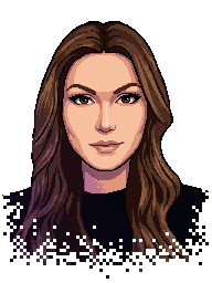 Open
Open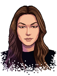 Half
Half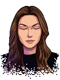 Shut
Shut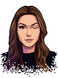 Wink
Wink
Themes, with a bit of pride
Dark mode is the default for everyone, because the galaxy looks best at night. Light is there if you want it. And then there are three fun ones: Pride, Trans and Norway.
Go on, try one. The flags go all the way down: the illustrations, the heart and even the little town in the footer change colour. One lesson: the Norwegian cross is far too busy at sprite size, so small things get the flag's colours instead of its pattern.
No tracking, no cookie banner
This was the easiest decision and the one I'm proudest of. There's no analytics, no tracking and no third-party scripts. That means no cookie banner either.
I did consider a tool for measuring real-world speed, and said no. I'd rather not know than watch people.
Your browser only remembers what you choose or use here: language, theme, achievements and where you were on the page. The footer says so in plain words.
Secrets and achievements
A portfolio is a bit serious by nature, so I hid things in it. The classic cheat code works. The logo loves attention. There's a heart that needs CPR. Missing pages have a UFO. There are over thirty achievements in total, and finding all of them earns you a crown.
- ????The loop on the front page has a secret. Hover it, then click. Go look
- ????An old cheat code works anywhere on this site. Up, up…
- ????The theme menu up in the corner has more colours than you'd think. Try them all.
- ????Some pages don't exist. Find one of them.
- ????Scroll to the very bottom of any page and take the quick way back up.
- ????The easel in the post about rebuilding this site wants more paint. Go look
0 of 32 found · Achievements
The big illustration at the top of every case and post can be clicked, too. That includes the easel in this post (go and try).
A town in the footer
At the very bottom of every page there's a little pixel town at night, building a rocket together. Press "Back to top" and the rocket launches and carries you up the page.
The town was the hardest thing to size. On a phone it has to stay small, and on a huge screen it can't turn into giant blocks. Now the pixels stay the same crisp size on screens all the way up to 8K, and the town just keeps going to the left.
Making it light
Pixels are cheap, but code isn't always. Near the end I looked at how much each page actually weighs and found a few heavy things hiding in plain sight.
| Before | After | |
|---|---|---|
| Front page (HTML) | 677 KB | 298 KB |
| Front page, compressed | 153 KB | 46 KB |
| The footer town's drawing | 1,350 KB | 93 KB |
Measured on my own machine. Each row has its own scale.
The fixes were unglamorous: logos as small separate files, stylesheets the browser can cache, and a smarter way of drawing the town with bigger shapes and the exact same pixels. The Lighthouse performance score went from 83 to 88 locally.
Share cards
When someone shares a link, the preview is often the first thing people see. So every page got its own card in the same galaxy: my portrait on the front page, each case and post with its own sprite, and the UFO for pages that don't exist.
Share card for the front page
Share card for this post
Share card for a case
Share card for a missing page
What I'd do again
Keep
- Goals written as feelings
- One small visual rule for everything
- No tracking at all
- Secrets for the curious
Skip
- Following the system's light or dark setting
- Photo filters pretending to be pixel art
- Stylesheets inlined into every page
What I learned
Rebuilding your own portfolio is design work on hard mode. You're the client, the designer and the user, and all three have opinions.
What helped was the same thing that helps with any project. Clear goals. Small steps you can test. Writing decisions down. And someone saying "not yet" when it doesn't feel right. That part was always mine.
Now go click the easel (or the rocket at the bottom of the page).